
Product design, styling and branding for Tussell
/
The challenge
Tussell are looking to help companies win more public sector business. It's a huge market and the existing tools are lacking in both ease of use and functionality. I was brought on when they had really just the beginnings of a plan and needed someone to turn their ideas into a product. I designed the layout and interaction behaviour for the web app, and created their brand identity and styling.
The starting point
The founder had been conducting a lot of good research in the industry, and had a very clear idea of how Tussell would be different to the incumbent tools. There were some early wireframes that conveyed concepts rather than usable layouts, which gave me a useful starting point for designing the product.

Taking these, my role was to design the structure, 'onboarding' process and final interactions for the product. I went through a series of iterations with some light-weight usability sessions to help weed-out problems.
Some of the final designs
The homepage is interactive and allows a visitor, even without an account to start finding how much business they could win in their industry. They could also start exploring opportunities directly without entering any information by tapping the main call to action button. The defaults are very open, eg All contract values, All industries, Entire UK.

The main user interface for finding contract opportunities in the public sector is highly filterable timeline, so the user can narrow down appropriate opportunities in the upcoming weeks and months. The UI is single screen with the navigation being used for managing your contracts workflow.
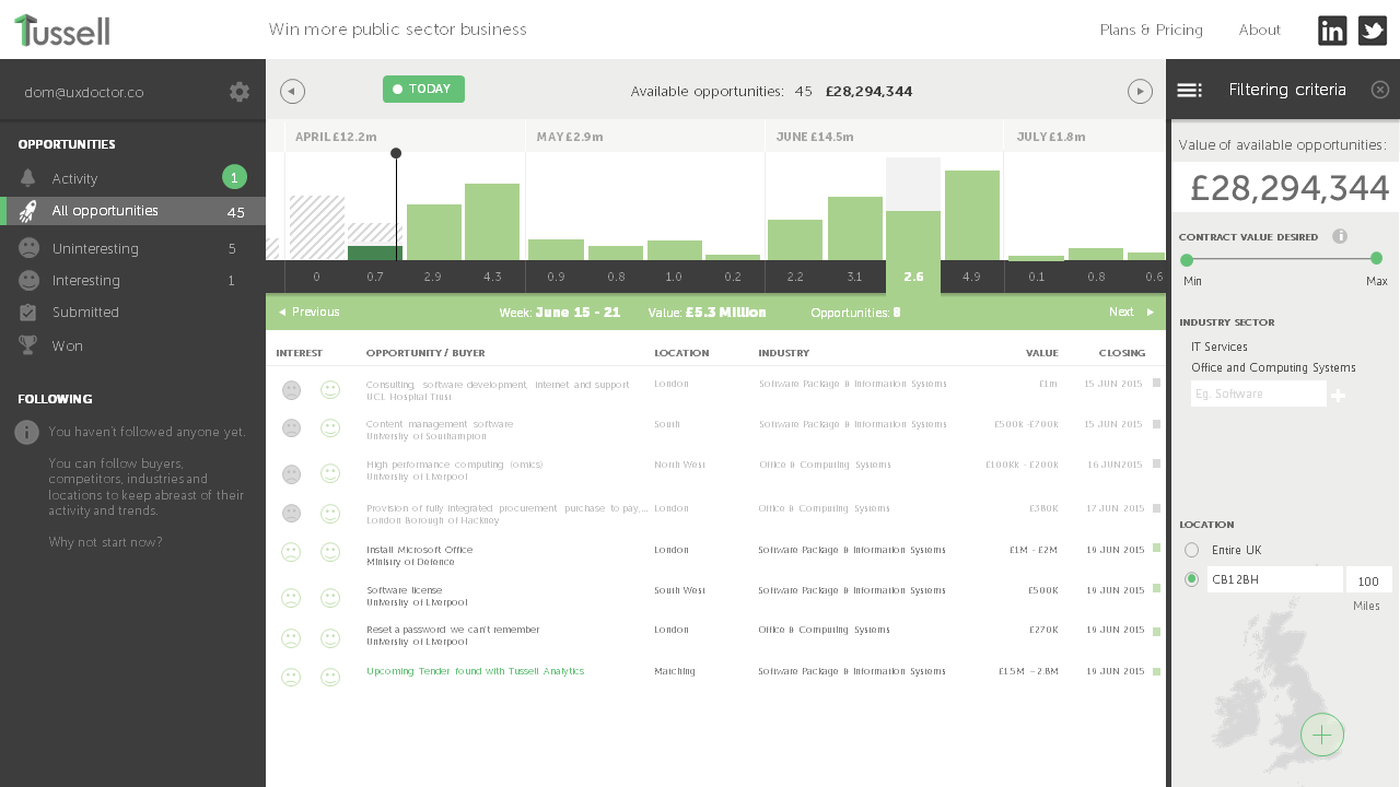
The user 'onboarding' process is relatively soft. If the user makes an action that requires the app to save some data, or a preference, it prompts the user to create a profile - so it can save it for them. Saving is a courtesy and to get the most out of the app, you really need to start organising upcoming opportunities. The prompt is friendly and provides justification.

A user can still browse valuable data, but it's obfuscated with stars. Revealing the data behind them requires a premium account. I think it gives the user a close view of the real value of the tool without actually showing them the data, and should help trigger subscription signups. It's tantalising.
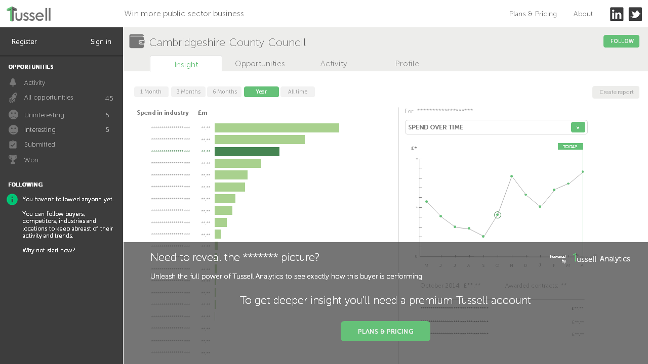
Later, when the user has a full subscription, they can access the full functionality of the tool which helps them understand their industry, competitors and where the work is.

Logo design
We explored a lot of logos before settling on the final design. Some were very much literal - conveying the sense of two parties coming together, but in the end the logo was kept simple, with just a simple distinctive letter T. This meant it could be used across all social media platforms and as a favicon. Here are some of the logo explorations I created:

And, here's the final Tussell logo:
Placeholder website
Whilst the web app was being developed we needed a simple public presence to send people to, and where they could register their interest. It's a single page and deliberately light on content to allow the key proposition to stand out:

Business cards
Carrying through the branding with a layout that's simple and provides space for the recipient to make notes:

